
VeeHive Case Study
A community-first media platform for creators and members. I led product and interaction design for a 7-month PWA launch, focusing on discoverability, moderation efficiency, and creator monetization.
Impact & Results
7 Months
Time to Market
PWA launch
73% Faster
Review Time
Moderation efficiency
30% Reduction
Time-to-Market
Via design system
+40%
Lead Generation
After website redesign
My Role
Lead UI/UX Designer (end-to-end): user research, interaction design, high-fidelity prototypes, and design QA. Coordinated with Product, Engineering, and CX daily.
Timeline
7 months from discovery to PWA launch, with continuous iteration and feature delivery post-launch.
Tools & Tech
Figma, JIRA, Design systems
The Problem
In a world with information overload and short attention span, content creators who want to build a strong community of like-minded individuals, don't have a reliable way to keep audiences engaged while allowing healthy exchange of dialog, knowledge & ideas.
TikTok, Instagram, etc although provide a way for audiences to consume content by creators, are inadequate, as these platforms:
- don't foster a sense of community among audience members
- don't allow for reliable sharing of knowledge and collaborative conversations for repeat access
- don't always produce high quality content in focused areas
Key Challenges
01
How might we enable content creators to share and manage high quality content.
02
How might we have broader appeal to audiences consuming content of any type - no matter video or text heavy.
03
Mobile-first audience with varied network conditions; performance and offline behavior were priorities
04
Balancing discoverability and personalization without overwhelming new users
05
Lack of analytics and tooling for creators and moderators to understand content performance
Define
Key tasks in the user journey of a content creator
- Post and manage content.
- Moderate the community for high quality content.
- Assign moderators to help manage different channels in case of multiple channels.
- Enhance creator monetization with improved onboarding and analytics.
Key considerations for redesign
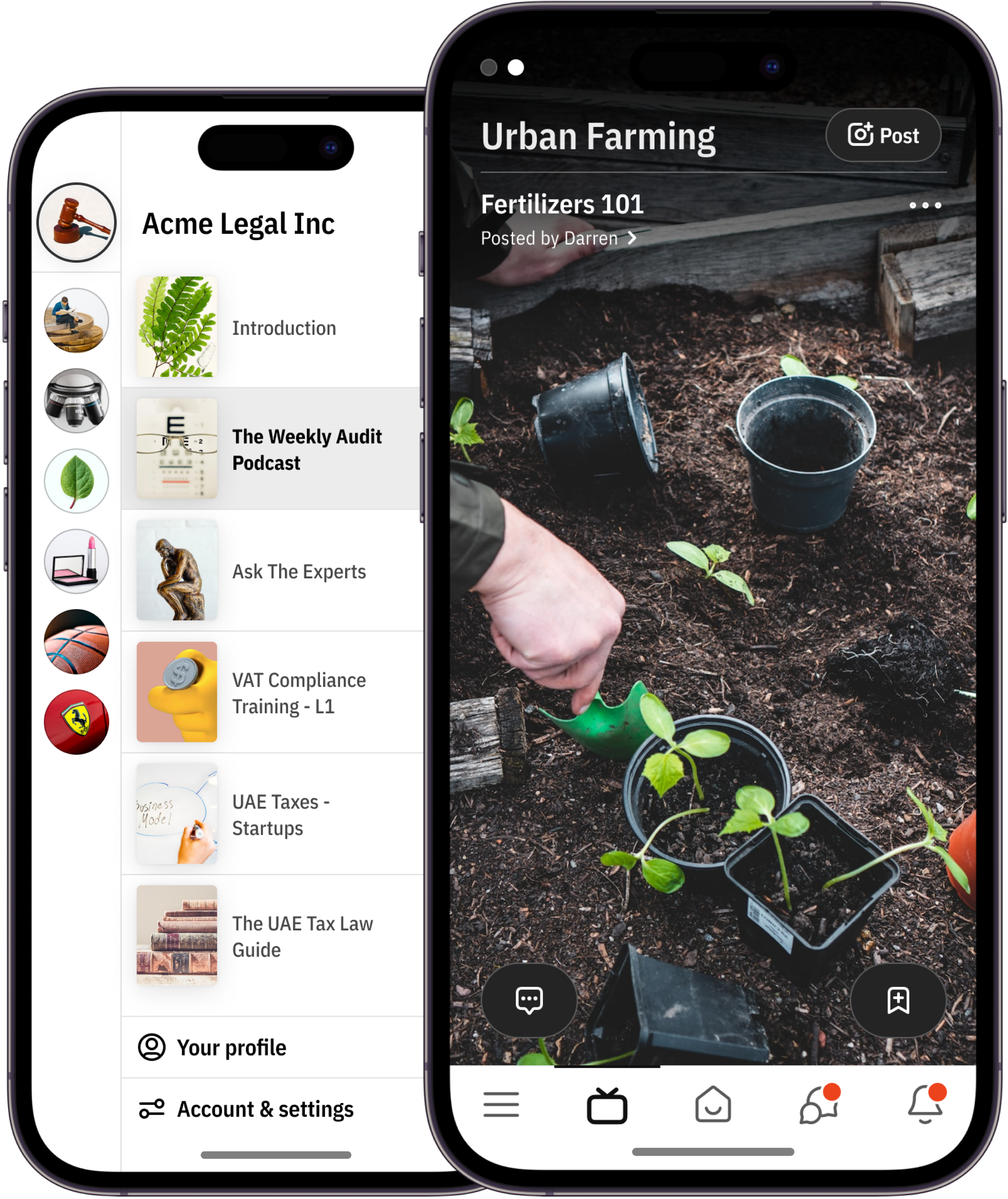
The UX of the mobile application was simple to use, but it was confusing and required a learning curve to understand unfamiliar UI elements. To reduce the learning curve and make it easier for users to use the application, we took inspiration from popular apps like TikTok, Slack, Discord, and WhatsApp.
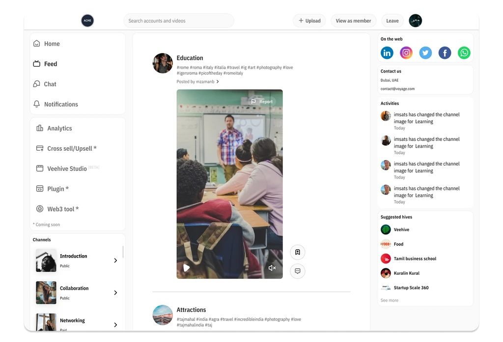
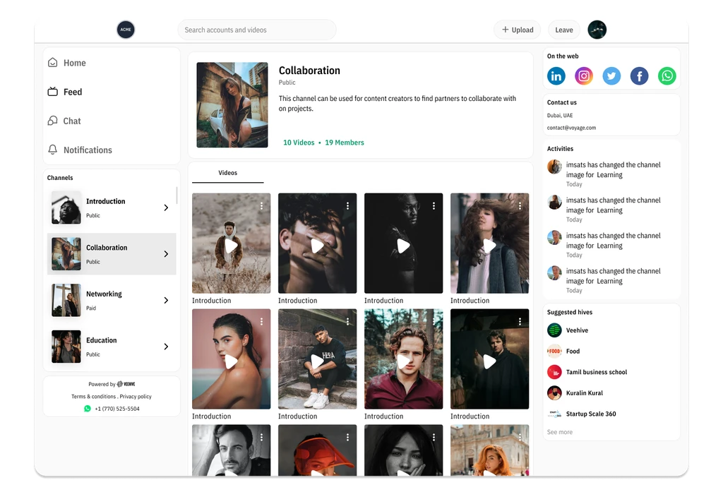
- Tik-Tok inspired us to use a channel feed for uploaded video content. This allows users to scroll through and consume content quickly. The channel feed also includes identifiable elements for which channel they are in, video title, description, posted by, and call-to-actions to access more information and bookmark videos.
- Slack & Discord inspired us to use a list itemization of channels to distinguish which community and channel users are in currently. This also optimizes the loading time for channel images, which previously took a lot of time to load all channel images at once in the community list.
- Whatsapp inspired us to include different chatrooms as opposed to a single group chat. This accommodates spaces for users to have meaningful conversations and allows community owners and moderators to moderate better.
Design Process
Research & Discovery
•
Stakeholder interviews to align goals and constraints .
•
User interviews with creators, moderators, and members to surface pain points
•
Competitive benchmarking of moderation tooling and creator platforms
•
Synthesized insights into personas and prioritized JTBD
Define & Prioritize
•
Mapped the user journeys for creators, members, and moderators
•
Defined success metrics (DAU, retention, moderation throughput, creator conversion)
•
Created a prioritized roadmap balancing quick wins with strategic features
Ideation & Prototyping
•
Low-fidelity wireframes to explore feed patterns, onboarding flows, and moderation workflows
•
Iterative prototypes (mobile-first) focusing on feed scanning, content creation, and moderation actions
Validation & Testing
•
Moderated usability tests (5–8 users per round) to validate key flows (onboarding, posting, moderation)
•
Collected qualitative feedback and key task metrics (success rates, time-on-task)
•
Iterated on microcopy, affordances, and error states based on test results
Handoff & QA
•
Delivered documented components, design tokens, and interaction specs for engineering
•
Performed design QA and regression checks; tracked visual parity bugs and usability issues
Solution 01
Mobile-first Feed & Discovery
Mobile app for audience consumption - redesigned
Streamlined card layout and progressive loading to reduce cognitive load and improve session length. Personalized content ranking and subtle affordances for discovery (topic chips, follow suggestions).
Key Achievements:
•
It makes it easier to find the channels you need. You can quickly scan the list to find the channels that are relevant to you.
•
Simple and easy to use: The page is simple and easy to use, even for users who are not familiar with uploading videos.
•
It helps you stay organized. Organizing your channels can help you stay on top of what's happening and make it easier to find the information you need.
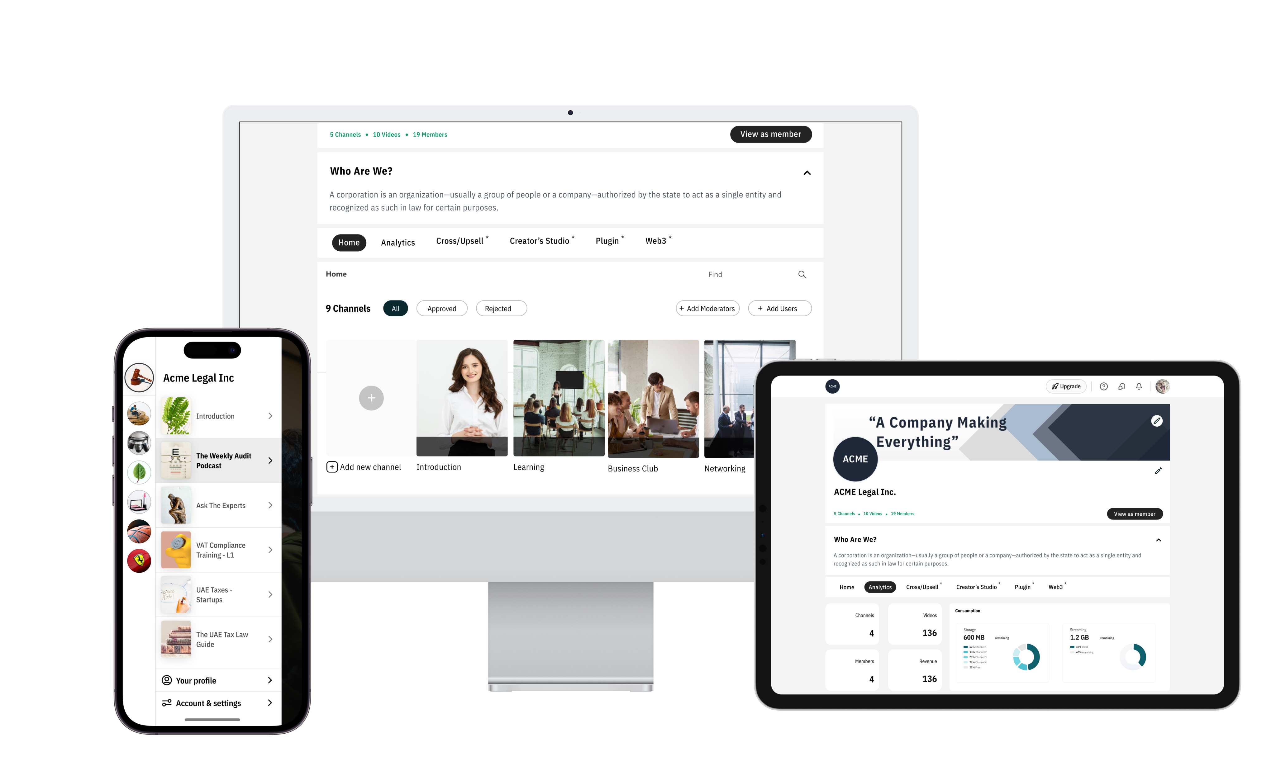
Solution 02
Creator Tools & Onboarding
Dashboard for content creators and community managers to share and manage content and manage audience engagement.
Simple creator onboarding flow with clear steps for monetization setup. Creator analytics dashboard showing top posts, engagement, and conversion actions.
Key Achievements:
•
30% reduction in time-to-market through design system
•
40% increase in qualified leads from website redesign
•
Conducted 8+ usability tests for optimization
•
15% increase in user satisfaction scores
Solution 03
Moderator Dashboard & Workflows
Batch review UI, flagging, and assignment features to speed up moderation. Prioritization queue (automated flags + manual review) to reduce time-to-review by 73%.
Key Achievements:
•
Increased revenue potential with dynamic monetization model
•
Reduced drop-off rates through optimized checkout flow
•
Conducted extensive surveys and interviews for pain point identification
•
Integrated behavioral design triggers for retention
Development & Design QA
As a Design QA, I support the engineering team by providing them with the assets, flow, and spec that they need to develop the product. I also work with the engineering team to identify and resolve any potential issues with the design. Once the code is ready, I test the product to ensure that it meets the requirements and that it is free of bugs. When I find bugs, I report them to the engineering team. I also work with the engineering team to prioritize the bugs and to verify that the bugs have been fixed. I prioritize them based on the following criteria:
- The severity of the bug
- The impact of the bug on the user experience
- The ease of fixing the bug
Learnings & Reflection
Learnings
- The importance of collaboration between the design and engineering teams.
- The importance of user testing to ensure that the design is user-friendly and meets the needs of the users.
- The importance of iterating on the design based on feedback from users.
Reflection
- I am proud of our project work. We created a user-friendly design that meets user needs and is visually appealing.
- I learned a lot about the importance of collaboration, user testing, and iterating on the design. I am confident that these lessons will help me to be a better designer in the future.
Development & Design QA
We faced various challenges during the testing, design, and other stages of the process, such as time constraints, budget constraints, unrealistic expectations, technical difficulties, and user feedback. To overcome these difficulties, we implemented the following strategies:
- Planning ahead
- Communicating effectively
- Using the right tools
- Being flexible
- Seeking assistance when necessary
VeeHive Case Study
A community-first media platform for creators and members. I led product and interaction design for launch, focusing on discoverability, moderation efficiency, and creator monetization.
Impact & Results
7 Months
Time to Market
PWA launch
73% Faster
Review Time
Moderation efficiency
30% Reduction
Time-to-Market
Via design system
+40%
Lead Generation
After website redesign
My Role
I collaborated with cross functional team members comprising of Product Manager, Chief Architect, Front-End developer, CX Manager
Timeline
7 months from discovery to PWA launch, with continuous iteration and feature delivery post-launch.
Tools & Tech
Figma, JIRA, Design systems
The Problem
In a world with information overload and short attention span, content creators who want to build a strong community of like-minded individuals, don't have a reliable way to keep audiences engaged while allowing healthy exchange of dialog, knowledge & ideas.
TikTok, Instagram, etc although provide a way for audiences to consume content by creators, are inadequate, as these platforms:
- don't foster a sense of community among audience members
- don't allow for reliable sharing of knowledge and collaborative conversations for repeat access
- don't always produce high quality content in focused areas
Key Challenges
01
How might we enable content creators to share and manage high quality content.
02
How might we have broader appeal to audiences consuming content of any type - no matter video or text heavy.
03
Mobile-first audience with varied network conditions; performance and offline behavior were priorities
04
Balancing discoverability and personalization without overwhelming new users
05
Lack of analytics and tooling for creators and moderators to understand content performance
Define
Key tasks in the user journey of a content creator
- Post and manage content.
- Moderate the community for high quality content.
- Assign moderators to help manage different channels in case of multiple channels.
- Enhance creator monetization with improved onboarding and analytics.
Key considerations for redesign
The UX of the mobile application was simple to use, but it was confusing and required a learning curve to understand unfamiliar UI elements. To reduce the learning curve and make it easier for users to use the application, we took inspiration from popular apps like TikTok, Slack, Discord, and WhatsApp.
- Tik-Tok inspired us to use a channel feed for uploaded video content. This allows users to scroll through and consume content quickly. The channel feed also includes identifiable elements for which channel they are in, video title, description, posted by, and call-to-actions to access more information and bookmark videos.
- Slack & Discord inspired us to use a list itemization of channels to distinguish which community and channel users are in currently. This also optimizes the loading time for channel images, which previously took a lot of time to load all channel images at once in the community list.
- Whatsapp inspired us to include different chatrooms as opposed to a single group chat. This accommodates spaces for users to have meaningful conversations and allows community owners and moderators to moderate better.
Design Process
Research & Discovery
•
Stakeholder interviews to align goals and constraints .
•
User interviews with creators, moderators, and members to surface pain points
•
Competitive benchmarking of moderation tooling and creator platforms
•
Synthesized insights into personas and prioritized JTBD
Define & Prioritize
•
Mapped the user journeys for creators, members, and moderators
•
Defined success metrics (DAU, retention, moderation throughput, creator conversion)
•
Created a prioritized roadmap balancing quick wins with strategic features
Ideation & Prototyping
•
Low-fidelity wireframes to explore feed patterns, onboarding flows, and moderation workflows
•
Iterative prototypes (mobile-first) focusing on feed scanning, content creation, and moderation actions
Validation & Testing
•
Moderated usability tests (5–8 users per round) to validate key flows (onboarding, posting, moderation)
•
Collected qualitative feedback and key task metrics
•
Iterated on microcopy, affordances, and error states based on test results
Handoff & QA
•
Delivered documented components, design tokens, and interaction specs for engineering
•
Performed design QA and regression checks; tracked visual parity bugs and usability issues
Solution 01
Mobile-first Feed & Discovery
Mobile app for audience consumption - redesigned
Streamlined card layout and progressive loading to reduce cognitive load and improve session length. Personalized content ranking and subtle affordances for discovery (topic chips, follow suggestions).
Key Achievements:
•
It makes it easier to find the channels you need. You can quickly scan the list to find the channels that are relevant to you.
•
Simple and easy to use: The page is simple and easy to use, even for users who are not familiar with uploading videos.
•
It helps you stay organized. Organizing your channels can help you stay on top of what's happening and make it easier to find the information you need.
Solution 02
Creator Tools & Onboarding
Dashboard for content creators and community managers to share and manage content and manage audience engagement.
Simple creator onboarding flow with clear steps for monetization setup. Creator analytics dashboard showing top posts, engagement, and conversion actions.
Key Achievements:
•
30% reduction in time-to-market through design system
•
40% increase in qualified leads from website redesign
•
Conducted 8+ usability tests for optimization
•
15% increase in user satisfaction scores
Solution 03
Moderator Dashboard & Workflows
Batch review UI, flagging, and assignment features to speed up moderation. Prioritization queue (automated flags + manual review) to reduce time-to-review by 73%.
Key Achievements:
•
Increased revenue potential with dynamic monetization model
•
Reduced drop-off rates through optimized checkout flow
•
Conducted extensive surveys and interviews for pain point identification
•
Integrated behavioral design triggers for retention
Development & Design QA
As a Design QA, I support the engineering team by providing them with the assets, flow, and spec that they need to develop the product. I also work with the engineering team to identify and resolve any potential issues with the design. Once the code is ready, I test the product to ensure that it meets the requirements and that it is free of bugs. When I find bugs, I report them to the engineering team. I also work with the engineering team to prioritize the bugs and to verify that the bugs have been fixed. I prioritize them based on the following criteria:
- The severity of the bug
- The impact of the bug on the user experience
- The ease of fixing the bug
Learnings & Reflection
Learnings
- The importance of collaboration between the design and engineering teams.
- The importance of user testing to ensure that the design is user-friendly and meets the needs of the users.
- The importance of iterating on the design based on feedback from users.
Reflection
- I am proud of our project work. We created a user-friendly design that meets user needs and is visually appealing.
- I learned a lot about the importance of collaboration, user testing, and iterating on the design. I am confident that these lessons will help me to be a better designer in the future.
Challenges during Testing, Design or any part of process
We faced various challenges during the testing, design, and other stages of the process, such as time constraints, budget constraints, unrealistic expectations, technical difficulties, and user feedback. To overcome these difficulties, we implemented the following strategies:
- Planning ahead
- Communicating effectively
- Using the right tools
- Being flexible
- Seeking assistance when necessary