Parkin
A 3.0-star app with no competitor.
Dubai’s paid parking runs on one app. Nobody can switch away from it, so every usability failure turns into a fine, a dispute or a support call.
That removes the usual argument for good UX, that people will leave, and replaces it with three harder ones: lost payments, the cost of disputes, and a subscription business the app isn’t selling.
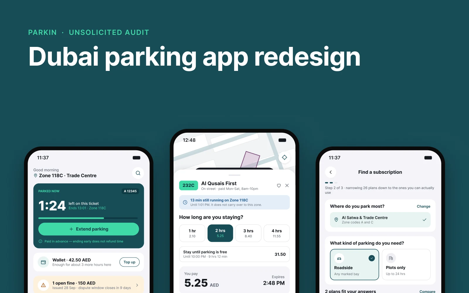
The brief
- Product
- Parkin operates Dubai’s paid public parking under a 49-year concession with the RTA, covering about 229,000 spaces (end of 2025). Drivers use the Parkin app, the RTA app or SMS, or they get fined.
- Business model
- Parking fees and subscriptions. Parkin’s CEO, Eng. Mohamed Abdulla Al Ali, has said “paid parking in private developer areas represents a significant growth opportunity for Parkin”, and the app is the sales channel for subscriptions.
- Why it mattered
- Failed payments are lost revenue, fines and disputes dominate the reviews, and the subscription flow, the growth story, is the weakest screen in the audit. Google Play rates the app 3.0 from 1.85K reviews; the App Store, 2.7.
The problem
Worked from the public iOS app, its store listings and parkin.ae, plus public Google Play and App Store reviews from July 2025 to September 2026. Not tested hands-on, so the findings are things to verify against the build.
The error leads nowhere
“No parking zone detected” is a black tooltip over the map with no action attached: no nearby zones offered, no prompt to enter the code, no retry.
Home leads with marketing, not the task
An eight-slide “What’s New” carousel sits above the fold. No active session, no wallet balance, no fines: the three things drivers open the app to check.
Twenty-six subscriptions on one flat list
No filter by vehicle, area or duration, only free-text search, and “Zone codes B and D” assumes knowledge most drivers don’t have. Every “Apply now” button reads as disabled.
The first price shown is the wrong one
The zone sheet advertises 2.10 an hour. Parkin’s own fee table reads 2.10, 5.25, 8.40, 11.55: the headline is true only for the first hour, and only off-peak.
One brand, five button systems
Five button styles across five screens, three segmented-control patterns stacked on one, four illustration styles in one grid. Five of the ten findings are component problems, not screen problems.
The app today
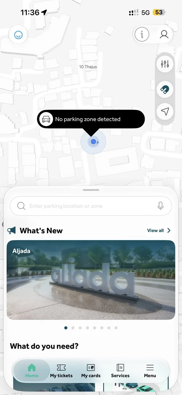
- The error is a tooltip with nothing attached: no nearby zones, no code entry, no retry.
- Under it, an eight-slide carousel leads the sheet.
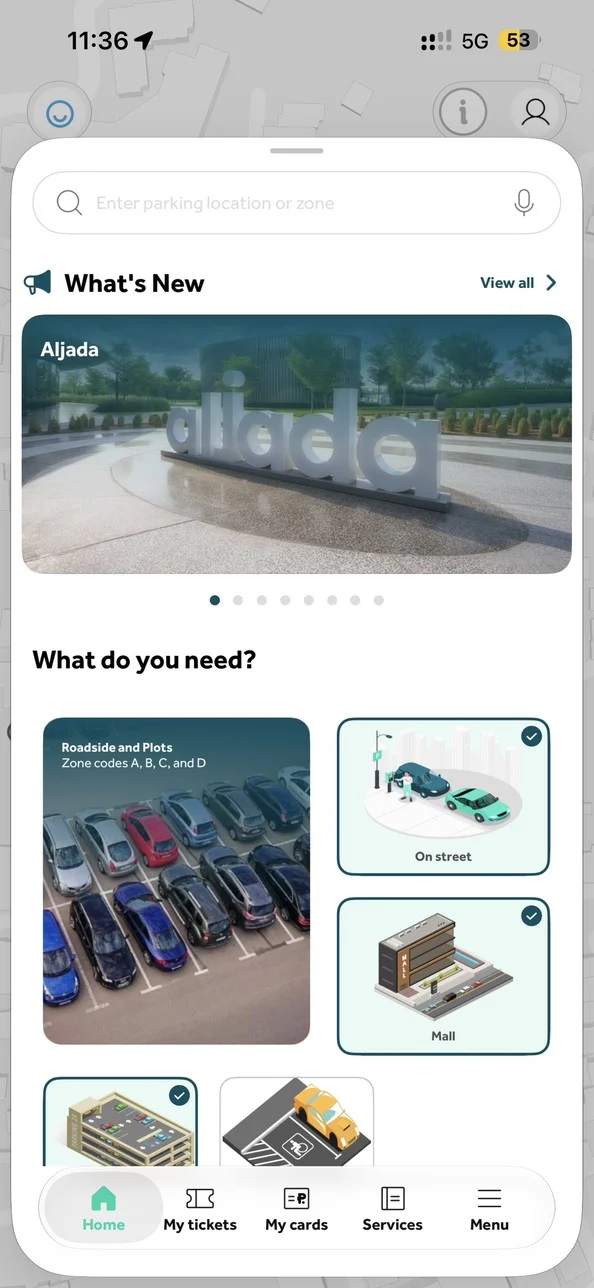
- Search, then “What’s New”: no running session, wallet or fines on the first screen.
- Photo, flat and isometric illustration share one grid, and the tick badges look like a selection.
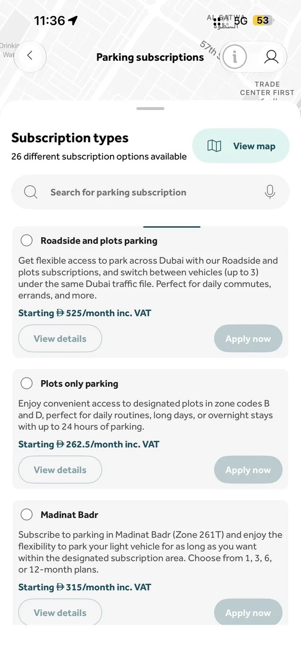
- 26 plans in one flat list, with free-text search only.
- “Zone codes B and D” assumes knowledge most drivers don’t have.
- Every “Apply now” is grey on grey and reads as disabled.
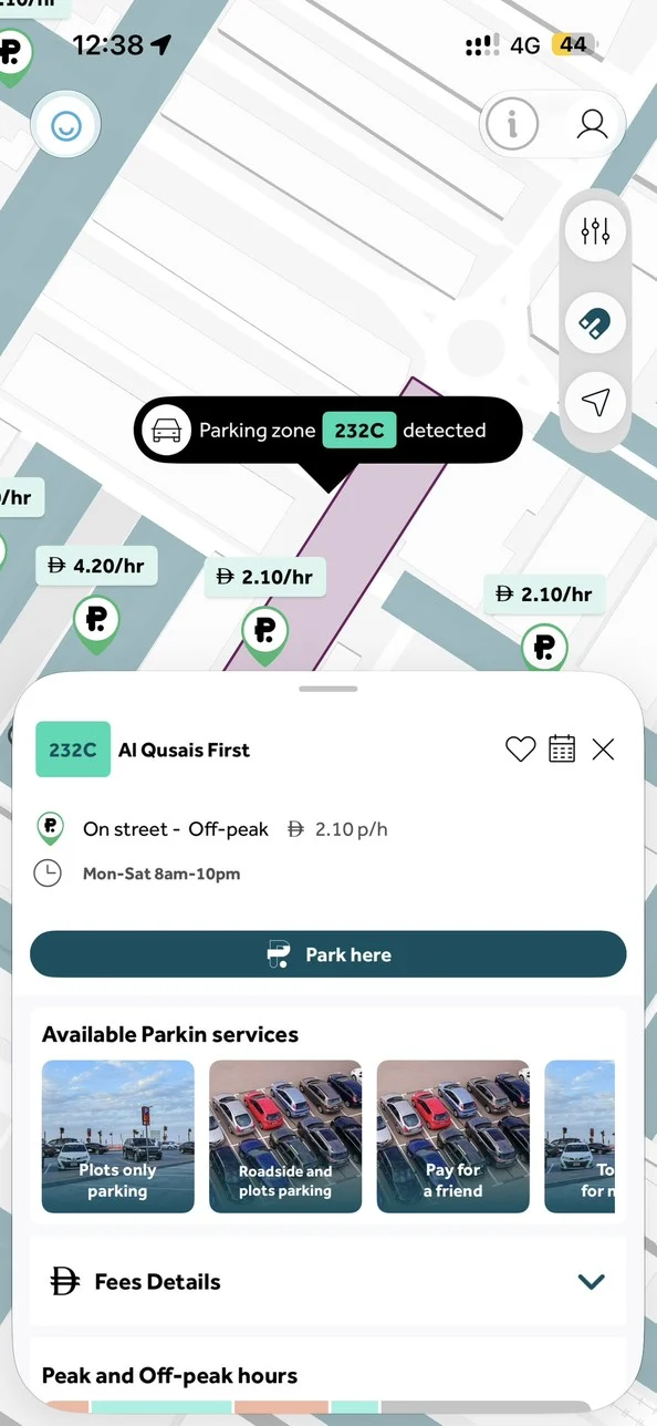
- The first price shown is “2.10 p/h”: true only for hour one, off-peak.
- Paying starts from “Park here”, two screens away from the total.
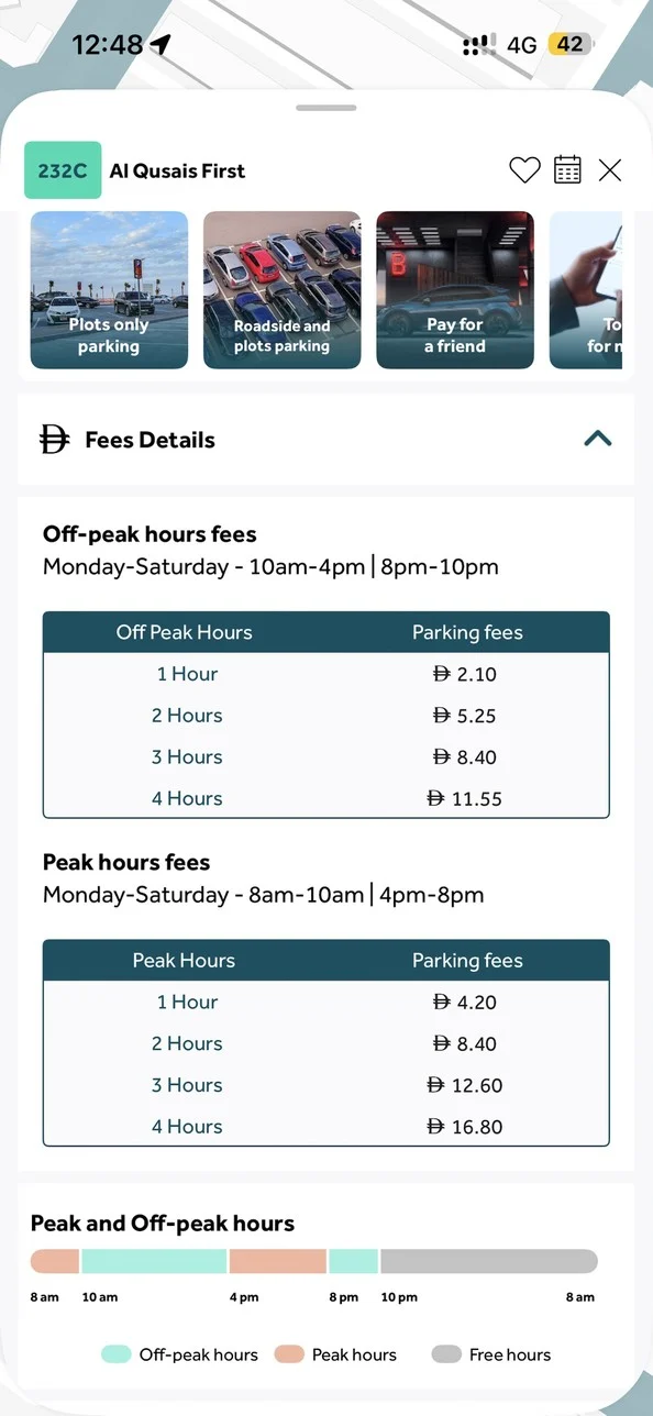
- The real table: 2.10, 5.25, 8.40, 11.55. Every hour after the first costs 3.15.
- The day band already shows peak, off-peak and free hours, out of sight here.
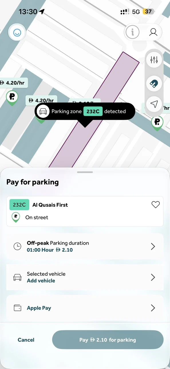
- Duration is a row to tap through to another screen.
- Pay is muted while the vehicle is unset, and nothing says the two are connected.
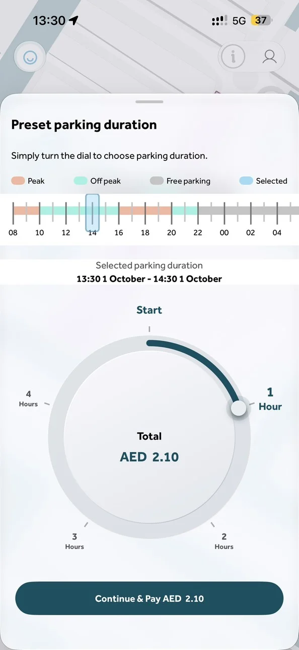
- The live total finally appears here, three screens in.
- The dial stops at 4 hours, though the band above shows parking turning free at 10pm.
The decisions
Order the launch screen by what’s true
A running session outranks everything, including a ticket left running in the zone behind you; then the detected zone; then, with neither, the nearest zones with codes, distances and live rates. Never a carousel first.
Three questions instead of 26 plans
Ask where you park and what kind of parking you need, then show the plans that fit, with real monthly prices and one clear primary action. All 26 stay one tap away.
Three screens to pay, rebuilt as one
Keep the day band and live total, move them into the zone sheet, replace the dial with priced chips plus “stay until parking is free”, and delete the per-hour headline.
Fix the component, not the screen
One button with three levels and a disabled style that always says why, one segmented control, one illustration language per job. Fixing these one screen at a time guarantees they come back next release.
Deep dive
Accessibility and Arabic
The App Store listing says the developer hasn’t indicated which accessibility features the app supports. For a service every driver in Dubai is required to use, that is the finding, not a footnote.
The contrast specimens are redrawn from screenshots, so the colour values are approximate. The deliverable is the list of pairs to measure against the build tokens, not a ratio I invented: 4.5:1 for body text, 3:1 for UI boundaries.
Arabic wasn’t verified; the screens reviewed are the English build. But four things don’t mirror for free: the asymmetric hero grid, carousel direction and dot order, the map tooltip’s anchor, and numerals and currency. They’re decided by how the layout is built, not by translating strings later.
Final design
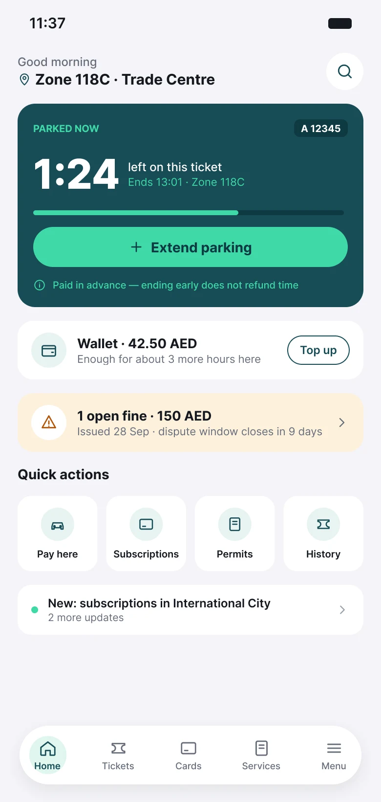
- Time left and Extend, before anything else.
- Wallet balance, and roughly how long it lasts here.
- Open fines, with the dispute window.
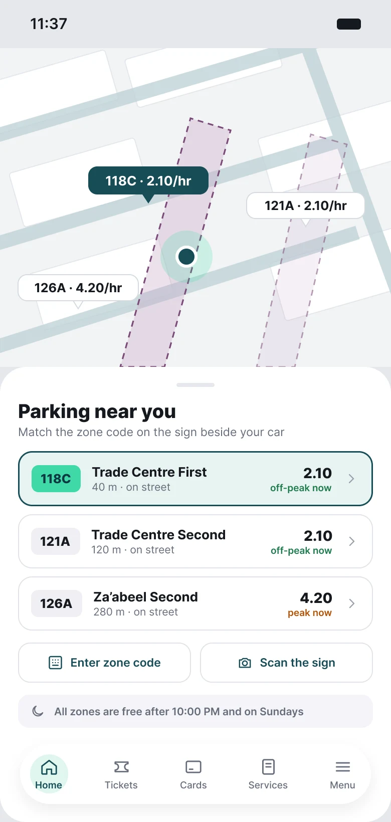
- No session and no zone: the nearest zones, priced.
- Enter the zone code or scan the sign.
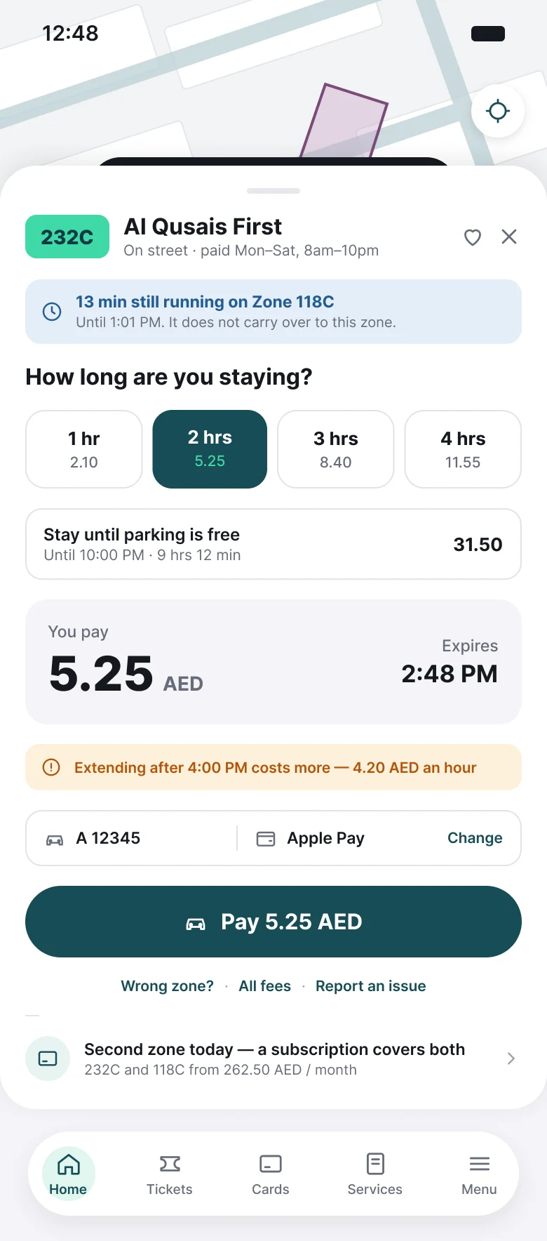
- Zone, price and pay on one sheet.
- Priced durations, plus “stay until parking is free”.
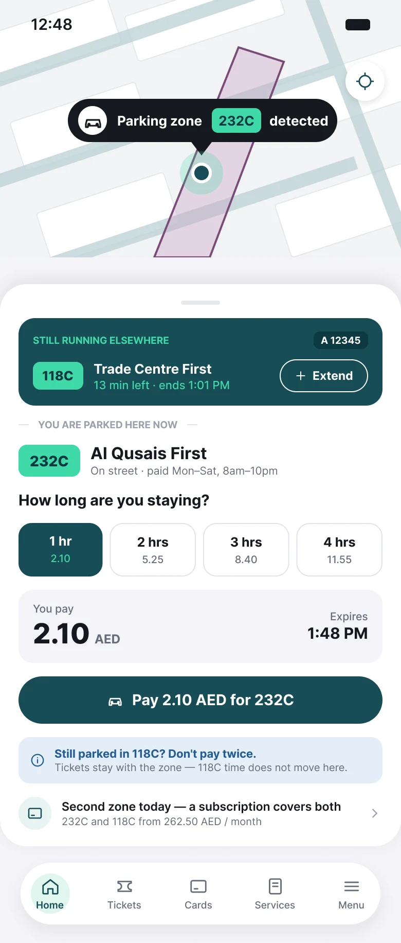
- A ticket still running elsewhere is shown first.
- Time doesn’t transfer between zones, and the screen says so.
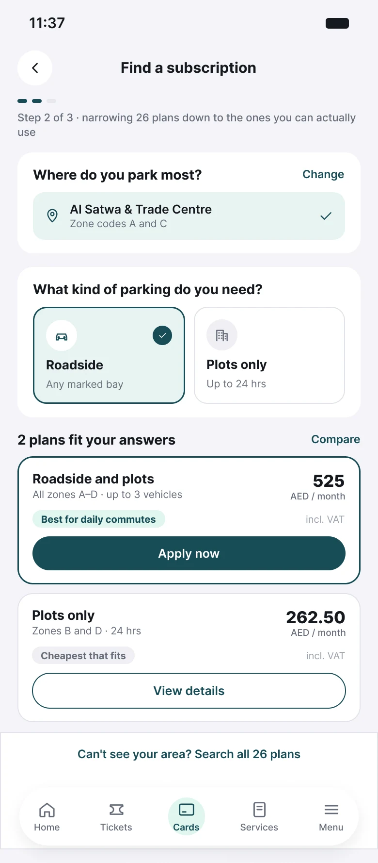
- Three questions narrow 26 plans down.
- Real monthly prices and one primary action.
What I’d measure
Time from opening the app to an active ticket. Share of tickets extended in-app rather than left to expire. Fines issued on zones where a ticket was running elsewhere. Subscription finder completion, and how many people reach a plan without opening the full list of 26.
Sources
- Public Google Play and App Store reviews, paraphrased · Jul 2025 – Sep 2026
- Parkin iOS app, App Store listing and parkin.ae · Oct 2026
- Parkin press release: “Parkin expands its private developer portfolio adding c.7,500 new spaces across 6 communities in Dubai” (CEO statement, 49-year RTA concession) · 6 Jun 2024
- Dubai Media Office: Parkin delivers record annual and quarterly revenues (FY2025 results, space count) · 25 Feb 2026