Botim
A calling app whose home screen forgot its job.
Botim is a free calling app. On audit, its home screen showed none of that: pinned shortcuts, a six-tile services grid and a gold rewards banner, with no way to see or start a call.
The catch is that the promotion isn’t a mistake. Calling is free, so gold and finance promotion is how Botim makes money. The fix had to move that revenue, not delete it.
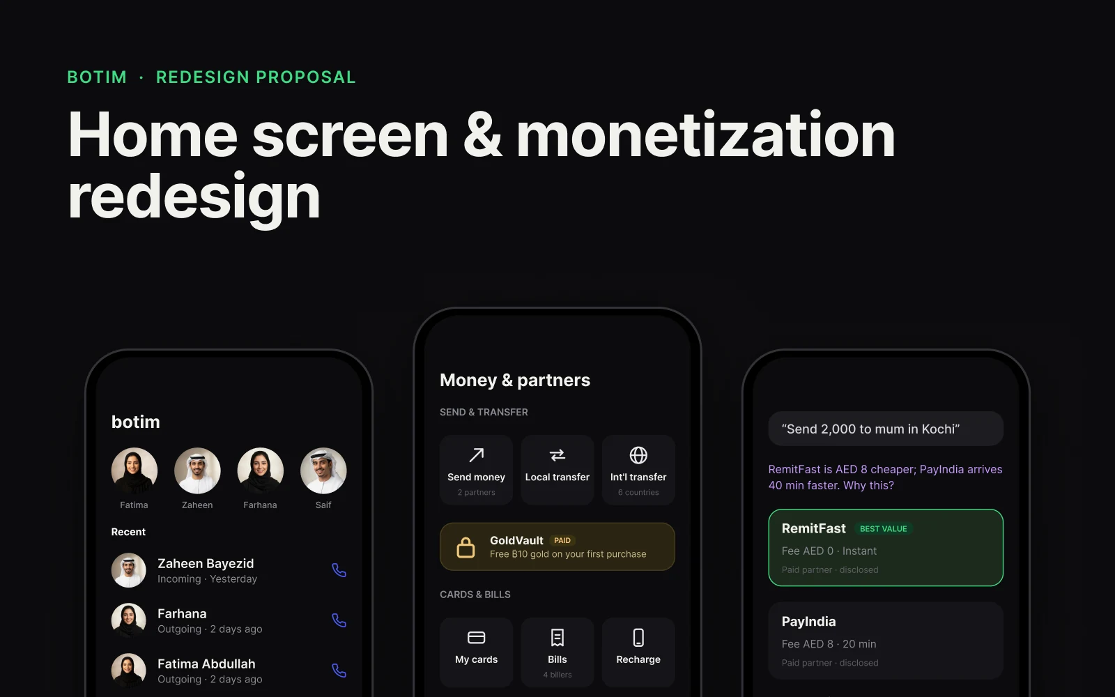
The brief
- Product
- Botim is a free HD voice and video calling app in the UAE, with money transfer, cards, bills, gold and credit built in.
- Business model
- Calling is free. Gold and finance promotion is the real monetisation layer, the same model as loyalty-linked banking.
- Why it mattered
- New and casual users open Botim to call someone and meet a fintech-first layout that doesn’t match why they came. The revenue content can’t simply go: it’s tied to a real business KPI, so any redesign has to keep or improve that number, not just satisfaction.
The problem
An on-device screenshot audit of Botim in the UAE: the Home, Chats, money and All tabs, reviewed against Botim’s stated core job, HD voice and video calling.
No calling content on the default Home tab
Home showed pinned shortcuts, a services grid, a gold rewards banner and a “For you” feed: zero recent contacts or call entry points. Calling needed an extra tab switch every session.
Chat list blended with paid promotion
Chats showed a “Gold & Silver Investment” ad and an official broadcast styled identically to real contacts, plus a “Stocks, Mutual Fund” ad card inline. It erodes trust in the list as a record of who actually contacted you.
Financial services front-loaded ahead of core use
The All tab organised Featured, Transfer, Pay, Credit and Invest as primary navigation: a calling app whose top-level navigation is entirely financial categories.
Exploration
- Home / tabs
- Balance / account card
- 2 shortcuts (cramped)
- 1 transaction + See all
- Suggested for You (~25% of screen)
- Tab bar
- Brand / Home
- Recent contacts row (call avatars)
- Quick-call CTA (last contact)
- Money & services (3 icons, condensed)
- Gold / loans / invest → (link, not block)
- Tab bar
- Call-end header
- Contact avatar + call meta
- Call again / Message
- Suggested offer (single, contextual)
- Recent calls list
- Tab bar
- Grey blocks only: the goal was proving the priority order, what sits above the fold, before any colour or type.
- Before: “Suggested for you” takes about a quarter of the screen.
- After: recent contacts and a quick-call button lead; money and services condense to one row.
- Monetised: a single, contextual offer after a call.
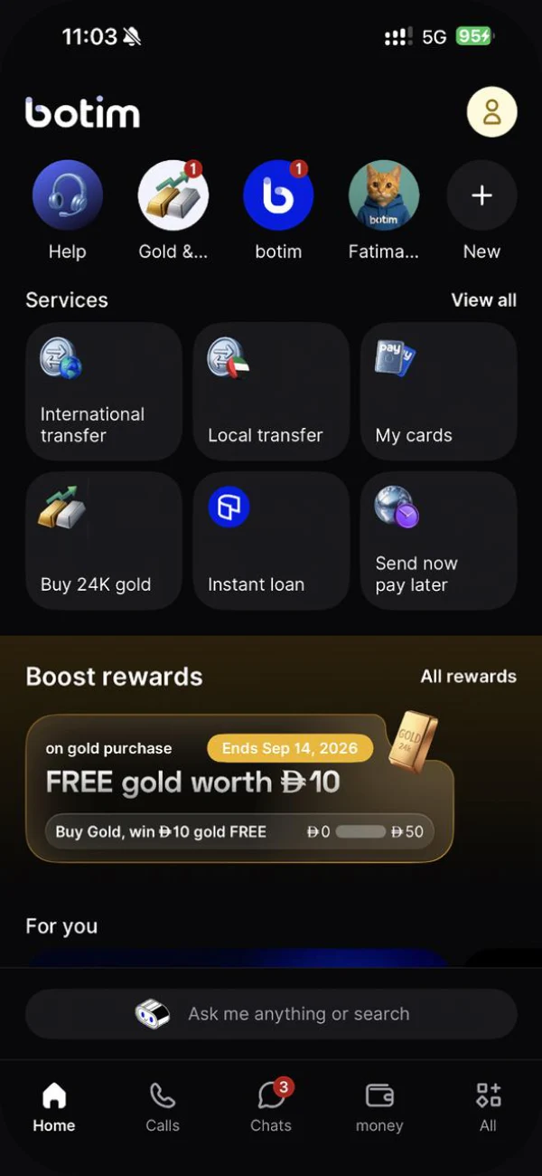
- Reconstructed from the audit, not invented: the layout matches a real screenshot.
- Shortcuts, a six-tile services grid and a gold rewards banner, and no way to start a call.
The decisions
Restore calling to Home
Favourites and recent calls sit above the fold, one tap each. The six-tile services grid becomes one labelled row: Send, Cards, Bills, More.
Move the offer, don’t remove it
The same offer type moves to the moment after a call, where the intent signal is stronger (you just called this person) than a blanket homepage banner.
Disclose every paid placement
An earlier pass reused the old rewards banner, undisclosed and tall enough to push a category off screen. The fix names the partner, marks it paid and shrinks it to a single row.
One bar for calling and money
Say or type a name: one match dials with a three-second undo; several are ranked by recency, never by whoever paid for placement.
Deep dive
The same rules, extended to partners
The disclosure and layout rules fixed here scale into a partner model. A partner spotlight appears once, only at cold start, never over a call. A paid partner can appear in money quotes but can never outrank the real best value. And a “data passport” shows exactly what’s shared with a partner, and what stays private, before anything is confirmed.
Partners can help pay for the product without ever standing in front of it.
Final design
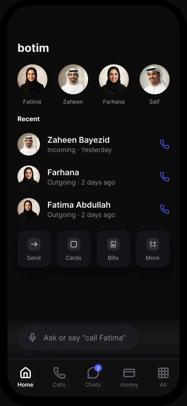
- Calling restored as the anchor: recent contacts and one-tap call sit above the fold.
- Money and services condense to a single row.
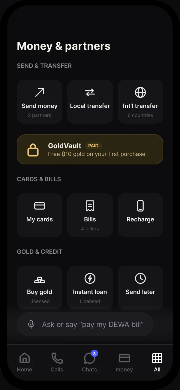
- Everything commercial, one level down: send, cards, bills and gold grouped by the job they do.
- The GoldVault offer still exists, labelled paid; it just stops competing with calling.
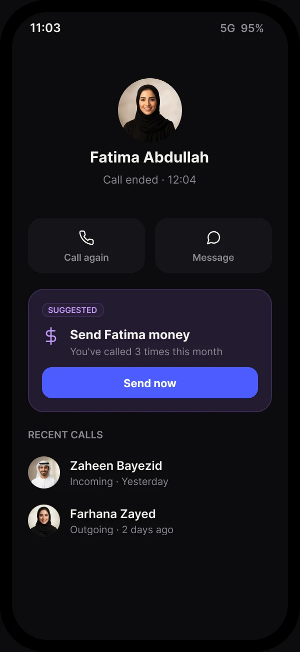
- Revenue moved, not removed: the same offer type as the old Home banner.
- Shown once, right after a real signal of intent.
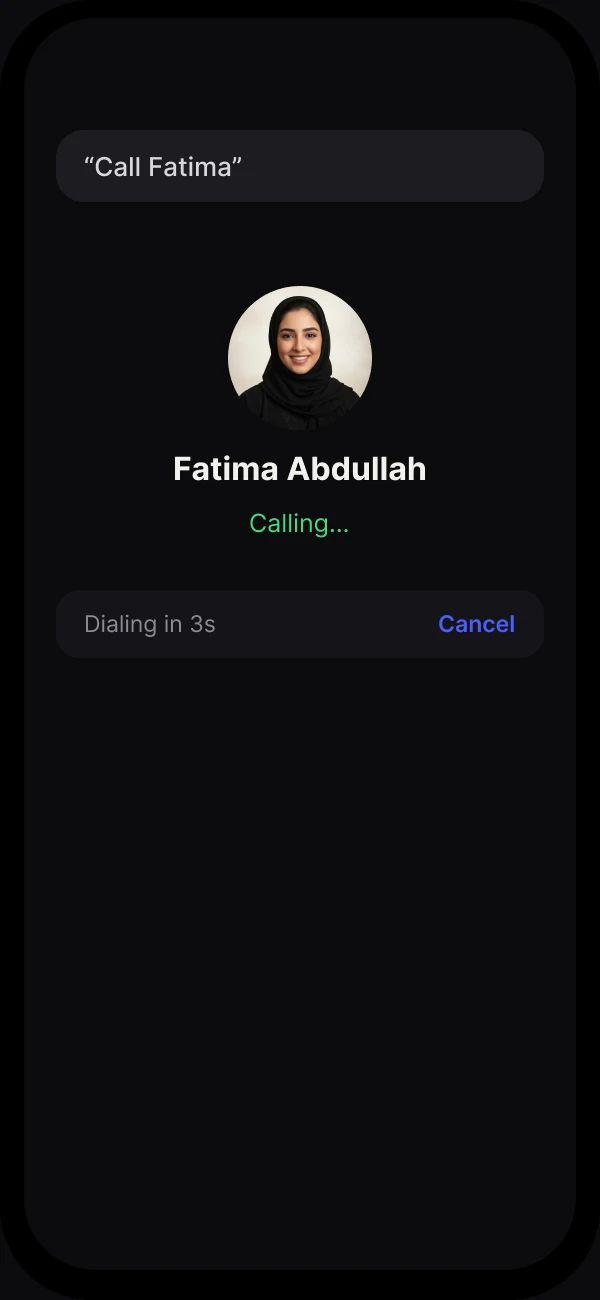
- Say it, then see it before it happens: a named contact and a three-second hold.
- A visible cancel. Voice never commits silently.
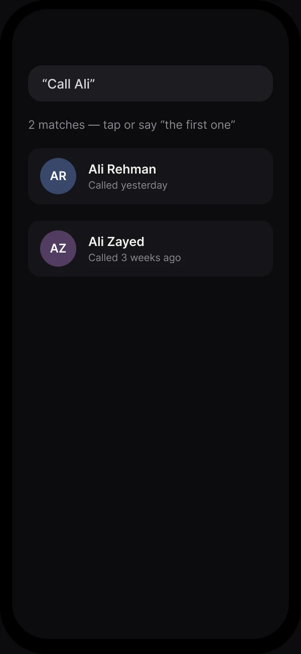
- Ambiguity is shown, not guessed: two people called Ali, ranked by recency.
- The system asks rather than picking and hoping.
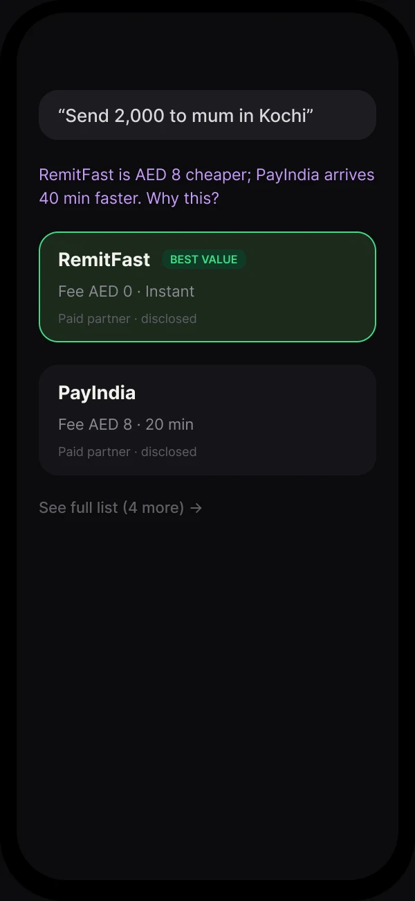
- Money commands show their working: two remittance partners compared on cost and arrival time.
- The cheaper one is marked, with a link to why that ranking was made.
What I’d measure
Offer conversion rate before and after the move, not just impressions. The hypothesis is that contextual placement converts better per impression, even with far fewer impressions shown.
Sources
- Botim app (UAE), screenshots from my own phone · 5 Sep 2026
- Figma: Botim case studies (final) · Oct 2026