UP by CBD
Theme, script and direction as modes, not separate designs.
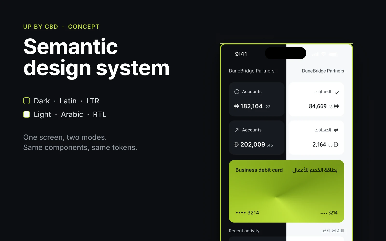
A concept semantic design system for UP by CBD: dark and light, Latin and Arabic, left-to-right and right-to-left. I took it on to cover a gap for a job role: a semantic design system.
The problem: four renderings of every screen without drawing four designs. Changing a value in one place has to change it everywhere, and nothing downstream should need editing when the theme or the script changes.
The brief
- Product
- Small and medium-sized businesses in the UAE. UP is Commercial Bank of Dubai’s digital bank for SMEs. Dark is the system’s default because UP is a dark product, and the default should be the one that ships.
- Business model
- A monthly subscription instead of a minimum balance: Start, Power and Scale at 49, 99 and 199 dirhams, each capping local transfers, international transfers and payroll runs.
- Why it mattered
- Theme and script both exist in the product, and they’re independent: dark Arabic and light Latin are both real. Stacked into one collection they need four modes, then eight when a fourth arrives.
The problem
I read the business from the outside first: CBD’s launch release, cbd.ae/up and its fees pages, the App Store listing and its reviews, and a benchmark against Wio Business, Mashreq NeoBiz and ADIB. I haven’t used UP myself.
Theme and script stacked into one axis
Combined into one collection, dark/light and Latin/Arabic multiply into four modes, and eight when a fourth arrives.
A text property holds one language
A component’s text property has one default for the whole set, so it can hold English or Arabic but never both.
Every combination drawn by hand
Built the usual way, a button’s 24 variants are 24 hand-built layouts, 22 of them duplicates, and changing the padding means editing 24 frames.
How it’s built
| Default | Loading | Disabled | |
|---|---|---|---|
| Primary | |||
| Secondary | |||
| Tertiary | |||
| Danger |
- Twenty-four states. Each holds one base instance and overrides two colours.
- Built from 4 hand-built layouts (2 labels, 2 bases) instead of 24: changing the padding means editing 1 frame.
- Latin, left to right, and Arabic, right to left, from the same components.
- Flow stays an explicit axis on the instance, so the loading spinner still appears in Arabic.
The decisions
No component may bind to a primitive
That single constraint is what buys dark mode, a rebrand and a second script: remap the semantic layer and nothing downstream changes. Primitives are hidden from publishing, so the library enforces it.
Theme and script as independent modes
Dark/light lives in one collection, Latin/Arabic in another. Kept apart, they multiply instead of adding.
Direction follows script, not choice
The script collection holds a flow variable, LTR in Latin and RTL in Arabic, bound on every instance. Switching a frame to Arabic mirrors every component on it.
Components built in three layers
A label, a base that owns all layout, and thin state wrappers. The same 24 choices a designer gets from a flat set, from 4 hand-built layouts, with one frame to change the padding.
Traded away: fewer variants
Driving the nested variant by a variable loses its sibling overrides: the loading spinner stops appearing in Arabic. So flow stays an explicit axis on the instance. The saving is in layouts drawn, not variants exposed.
Deep dive
One text base per style, carrying the script
Each of the eight text bases carries the typeface, the alignment and the Arabic string, so the script lives in one place. Components pull their copy from a base and never store a language; type into the nested base for custom copy and each script keeps its own.
That is what lets every right-to-left variant read Arabic without giving up per-instance wording.
Final design
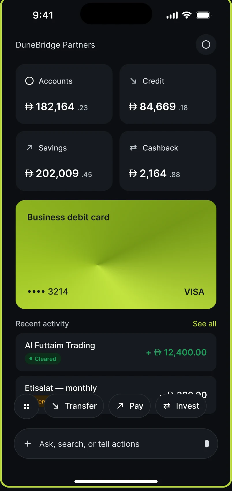
- Dark · Latin · left to right.
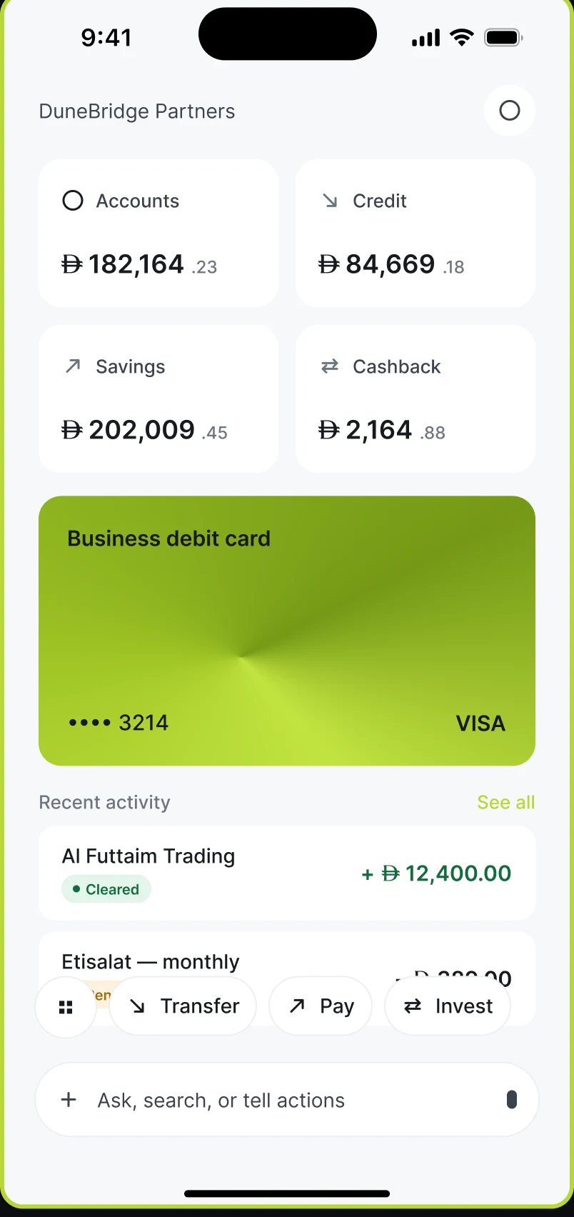
- Light · Latin: the same frame with the theme mode changed.
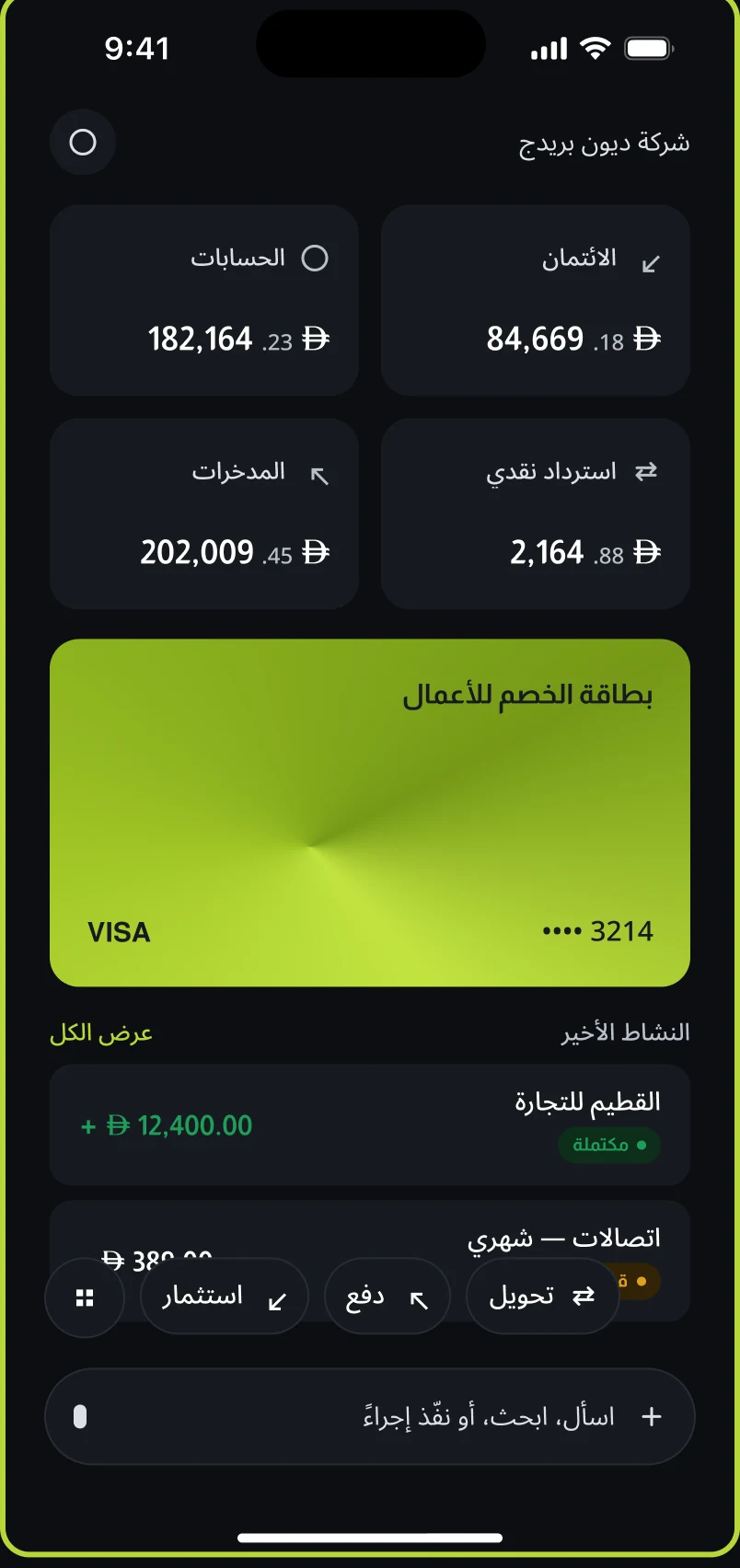
- Dark · Arabic: switching the script mirrors every instance.
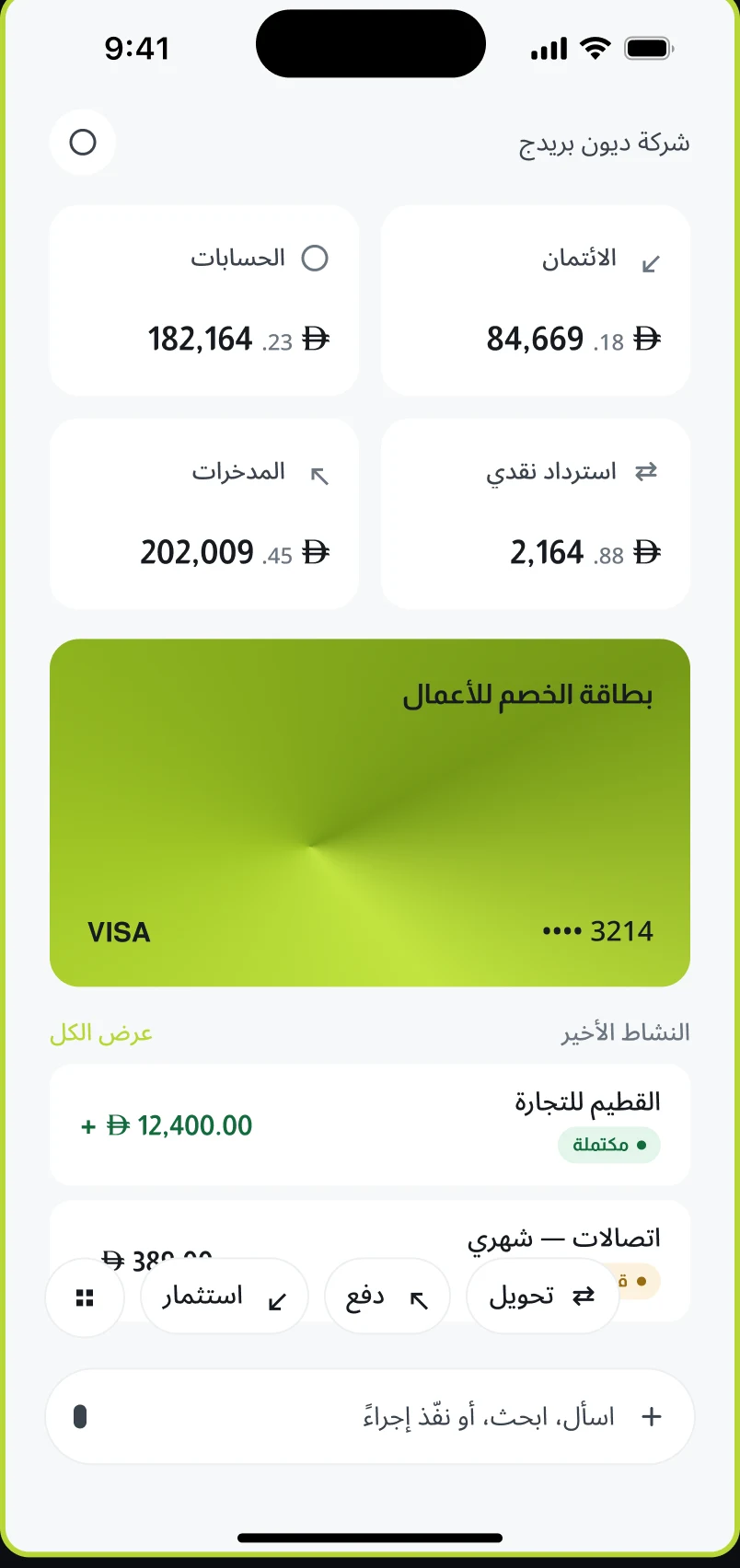
- Light · Arabic: no component edited, no layer moved.
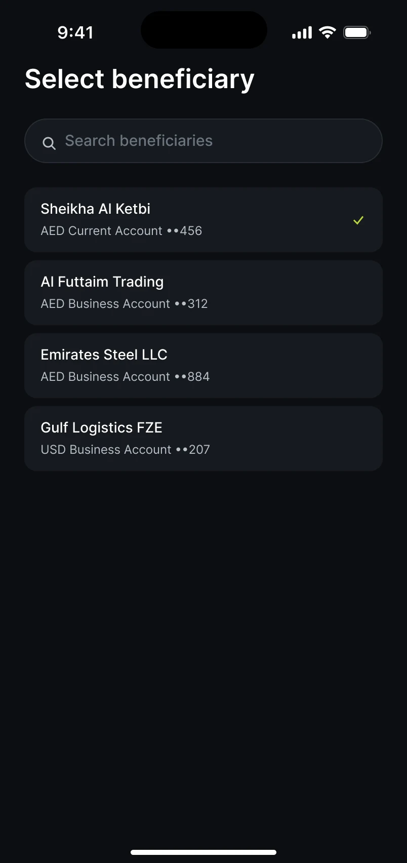
- Choose a beneficiary.
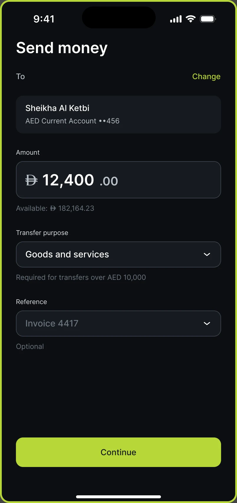
- Amount, purpose and reference.
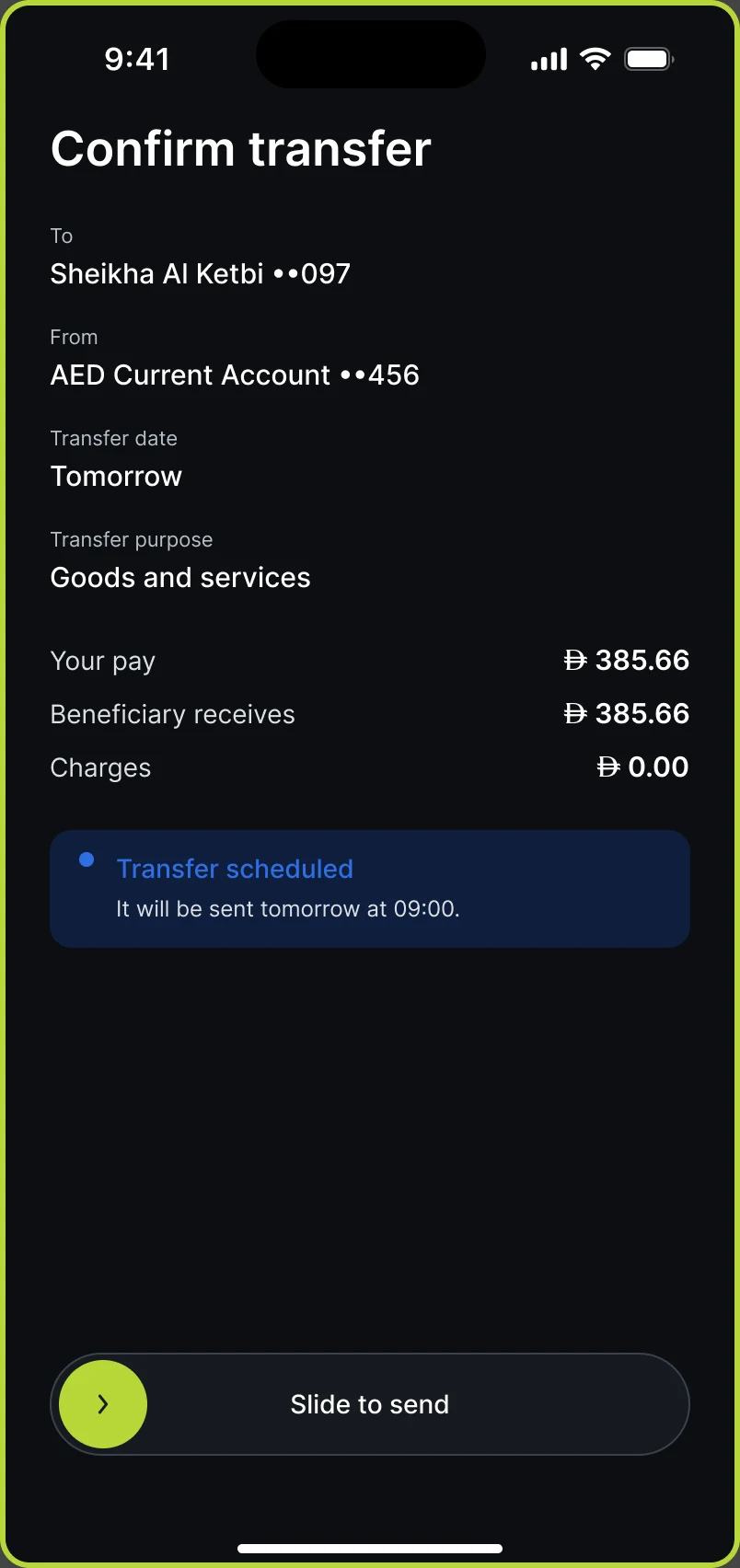
- Review, then swipe to send.
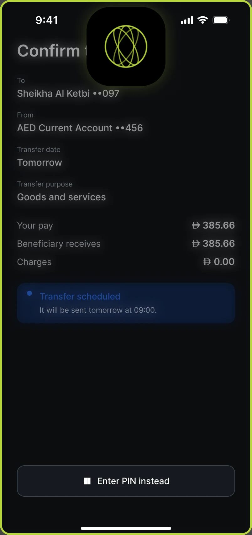
- Confirm with Face ID.
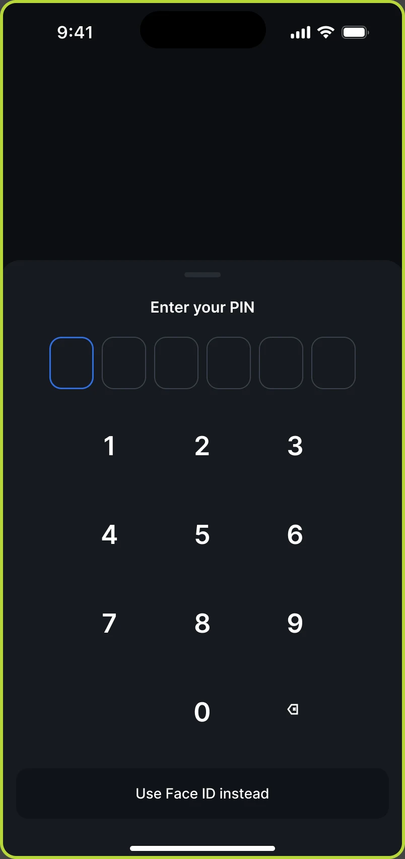
- PIN as the fallback.
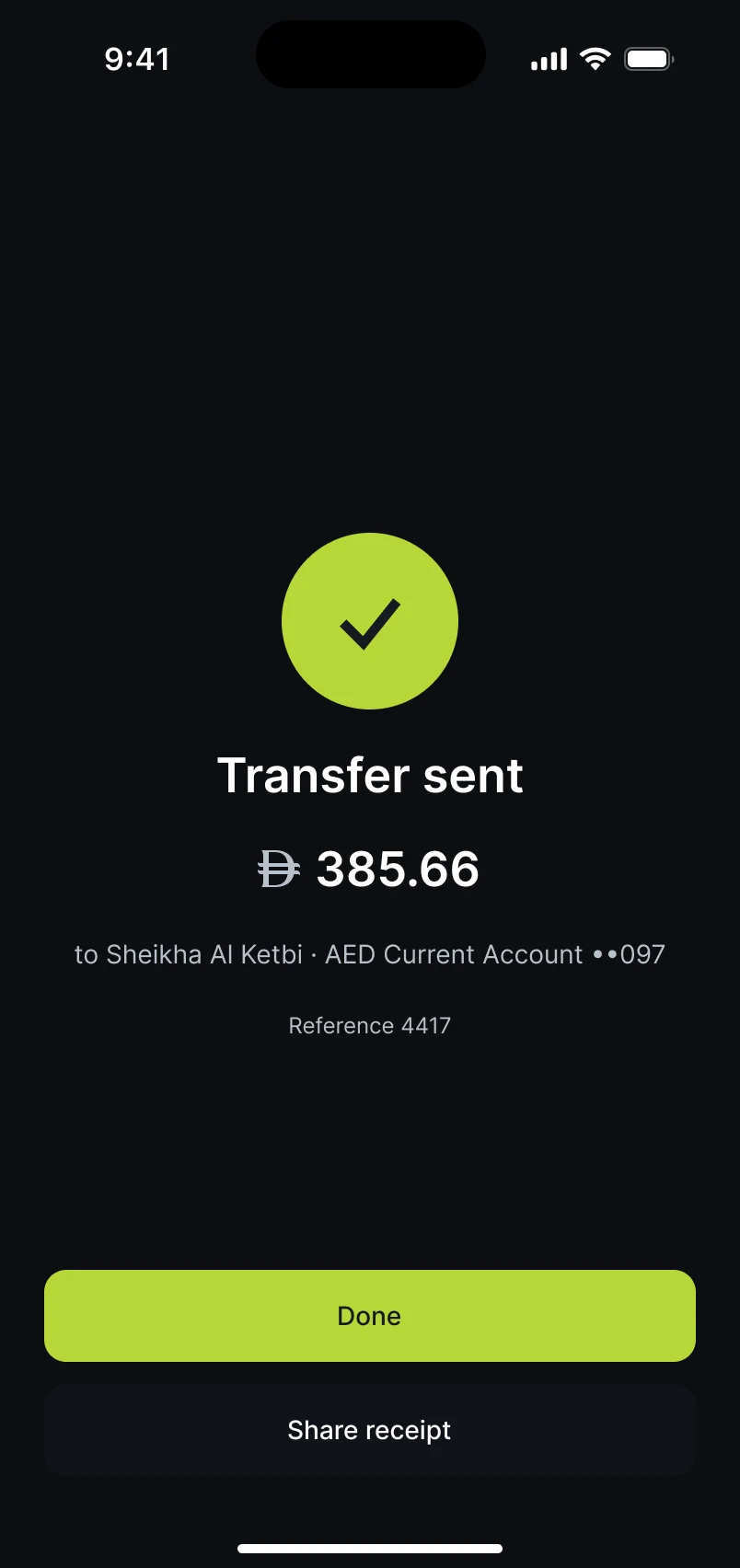
- Transfer sent, with a receipt to share.
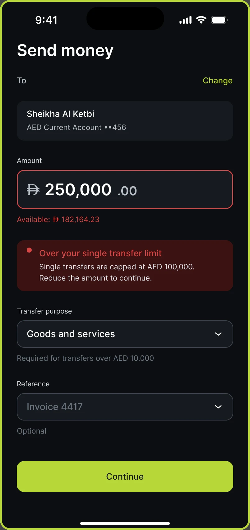
- Over the limit: the single-transfer cap is explained where the amount is entered.
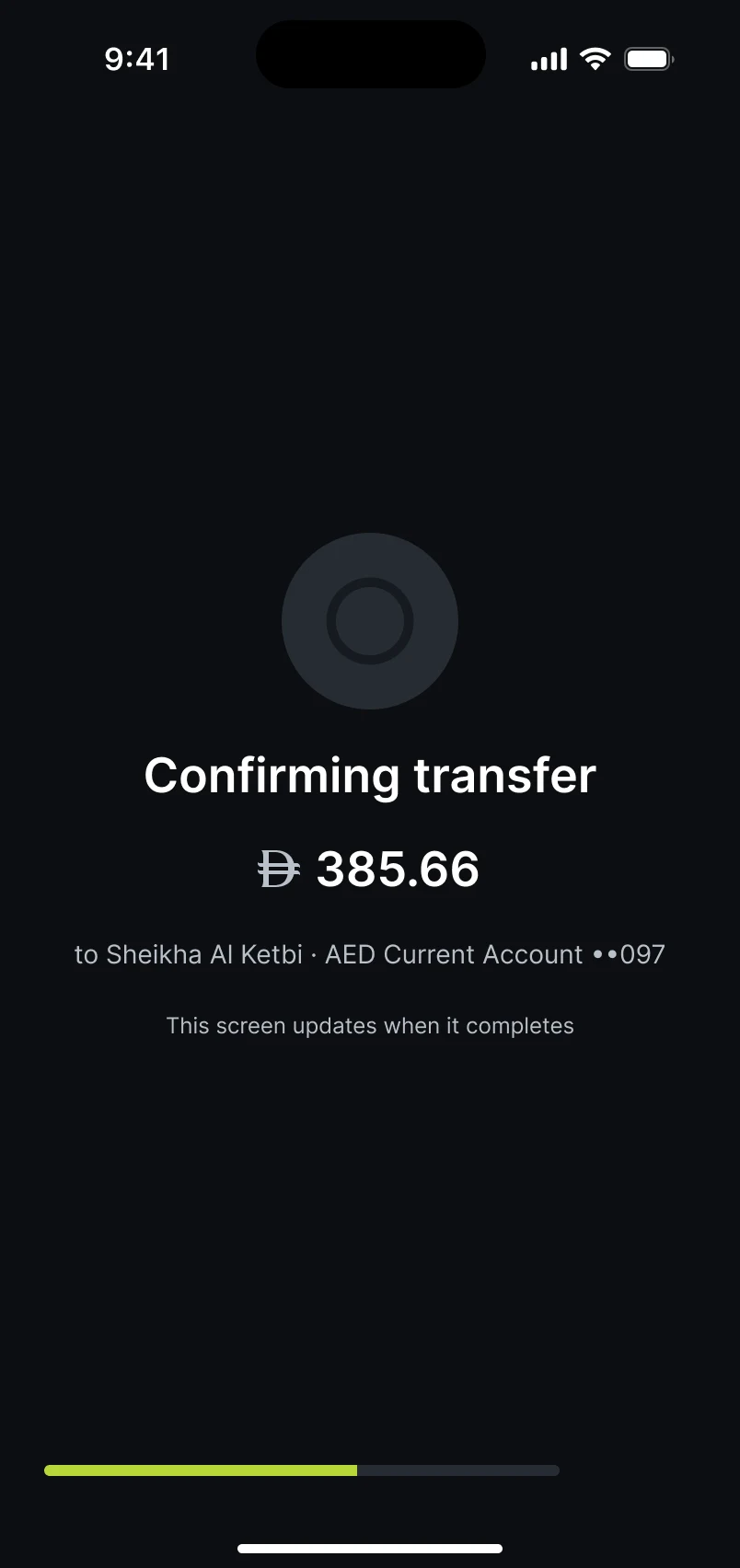
- Confirming: the screen updates when the transfer completes.
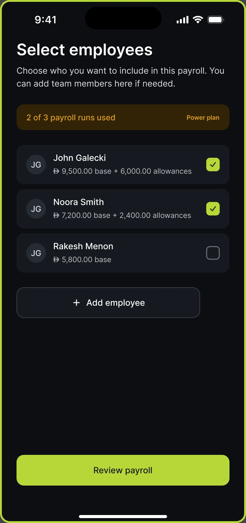
- Payroll: choose who to include, within the plan’s limit.
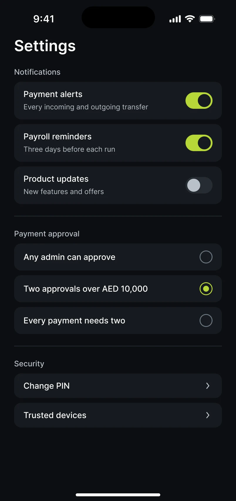
- Notifications, payment approval rules and security.
What I’d measure
How long a theme or copy change takes to reach every screen, and how many screens need hand-fixing when switching to Arabic.
Sources
- CBD launch release for UP · Jul 2026
- UP by CBD App Store listing and public reviews · 17 Sep 2026
- ADIB and DET Connect Account announcement · Jul 2026